Joni Mitchell's Blue Redesign
Graphic Design, Illustration
As an Art Direction assignment, in which the students were asked to elaborate a graphic proposal to an existent or made up album, I chose to redesign Joni Mitchell’s Blue. I wasn’t well acquainted with the singer’s work, so I did some more research and relied on Susan Lacy’s documentary “Joni Mitchell: Woman of Heart and Mind” (2003) as my main source of information.
College project created in 2021.

Photo by Paul C Babin
Joni is a canadian poet, painter and singer whose music mainly fits the rock, folk and jazz genres. She was strongly influenced by Joan Baez and Bob Dylan, being Dylan himself the responsible for introducing her to a more laid back way of dialogue through song, as in “Positively 4th Street”, for example: “You’ve got a lot of nerve to say that you’re my friend”. However, Mitchell would also cherish the melodic side of composition and seeked, therefore, a sort of balance in her work.
The singer would also use her music as a way of letting go of her reality and the issues she was facing, adding a strong confessional caracter to her lyrics. That’s the main theme of Blue.
At a high point in her career, Joni was spending time in Europe, distant from her beloved California. Surrounded by guilt and pressure, she felt detached from the Joni her audience would praise and look up to, so she decided to truly introduce herself through these ten songs.
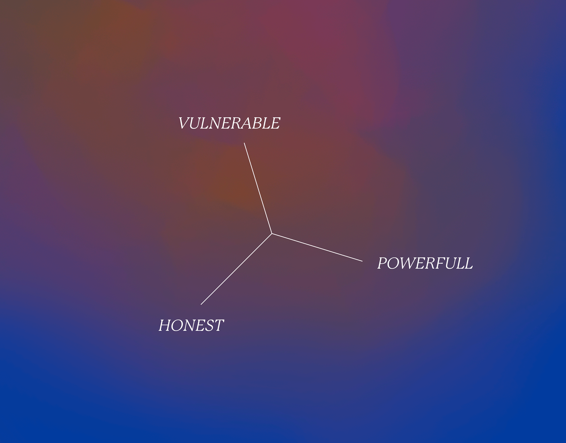
Through my research, I could define the main concepts of the project: honest, powerful and vulnerable.
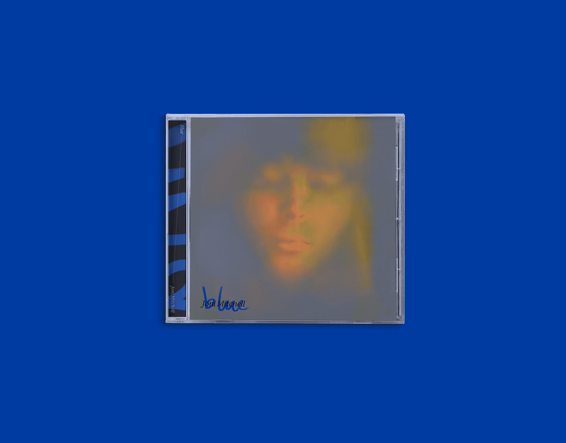
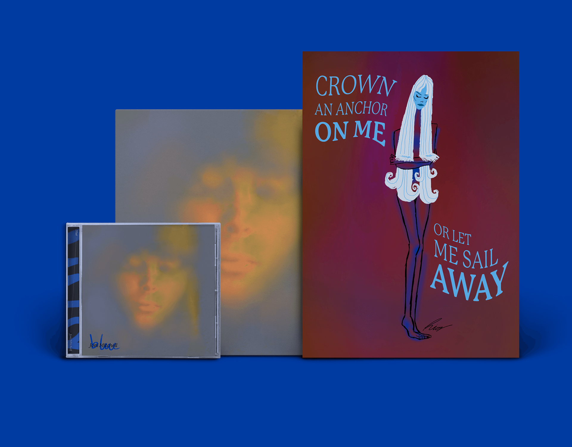
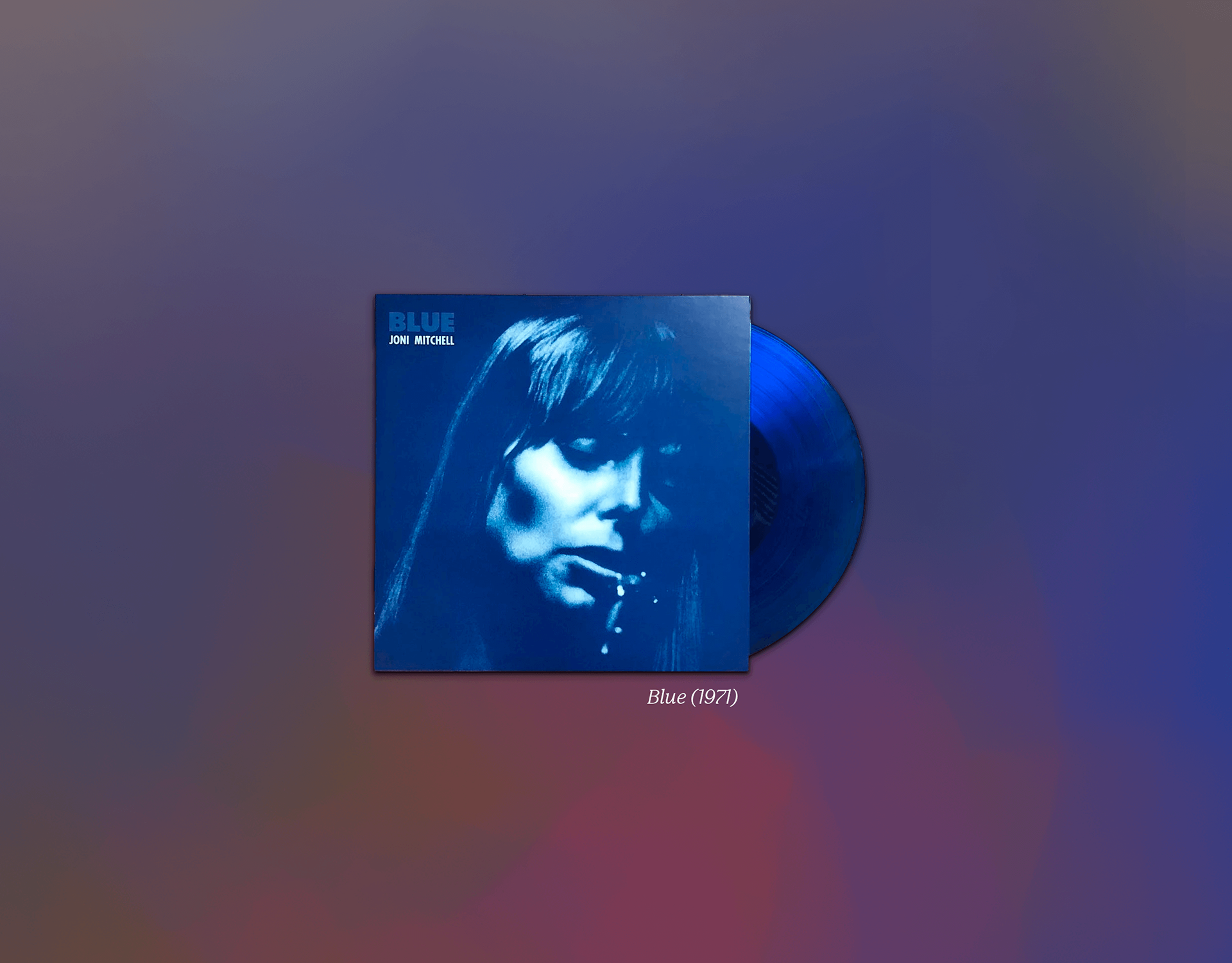
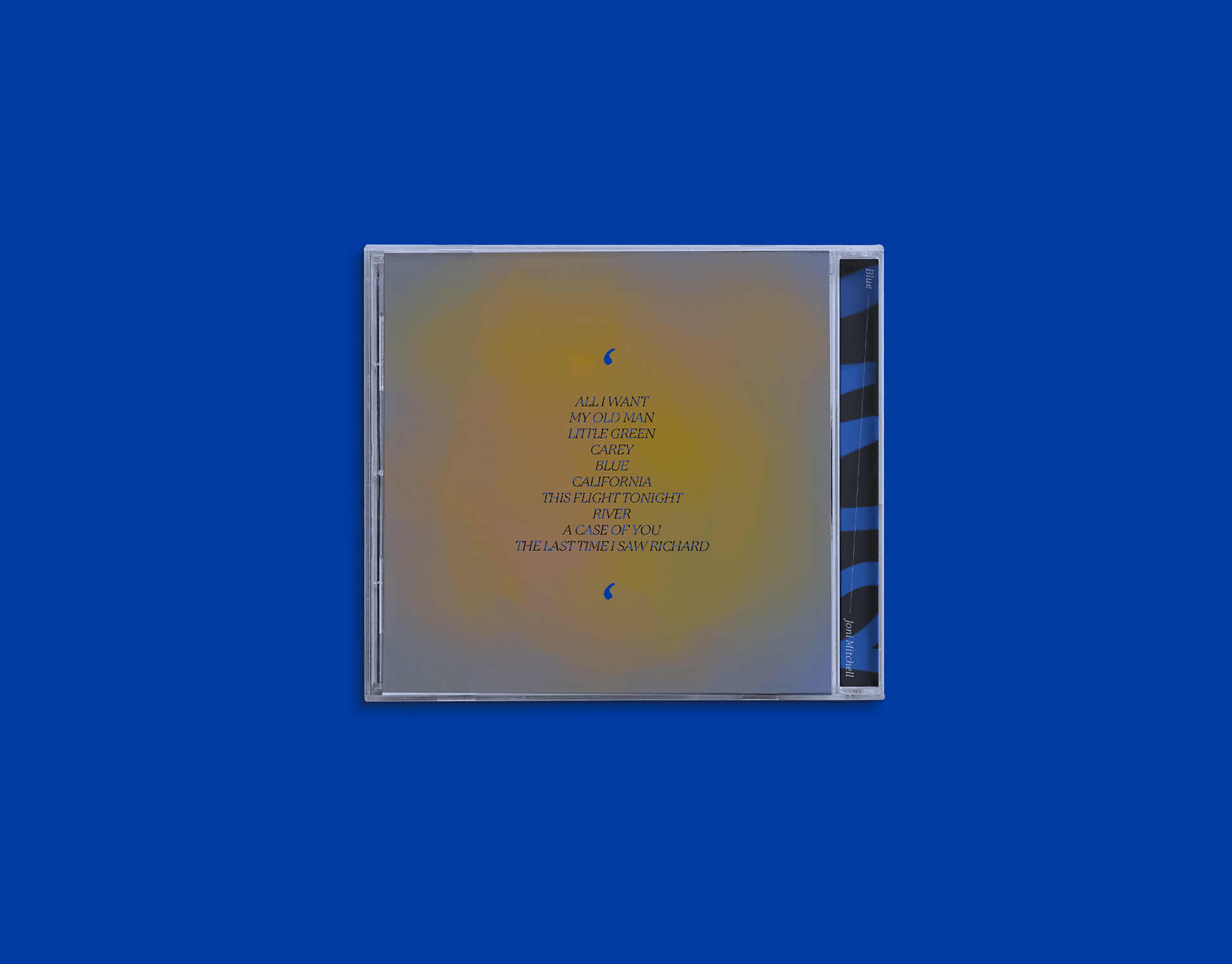
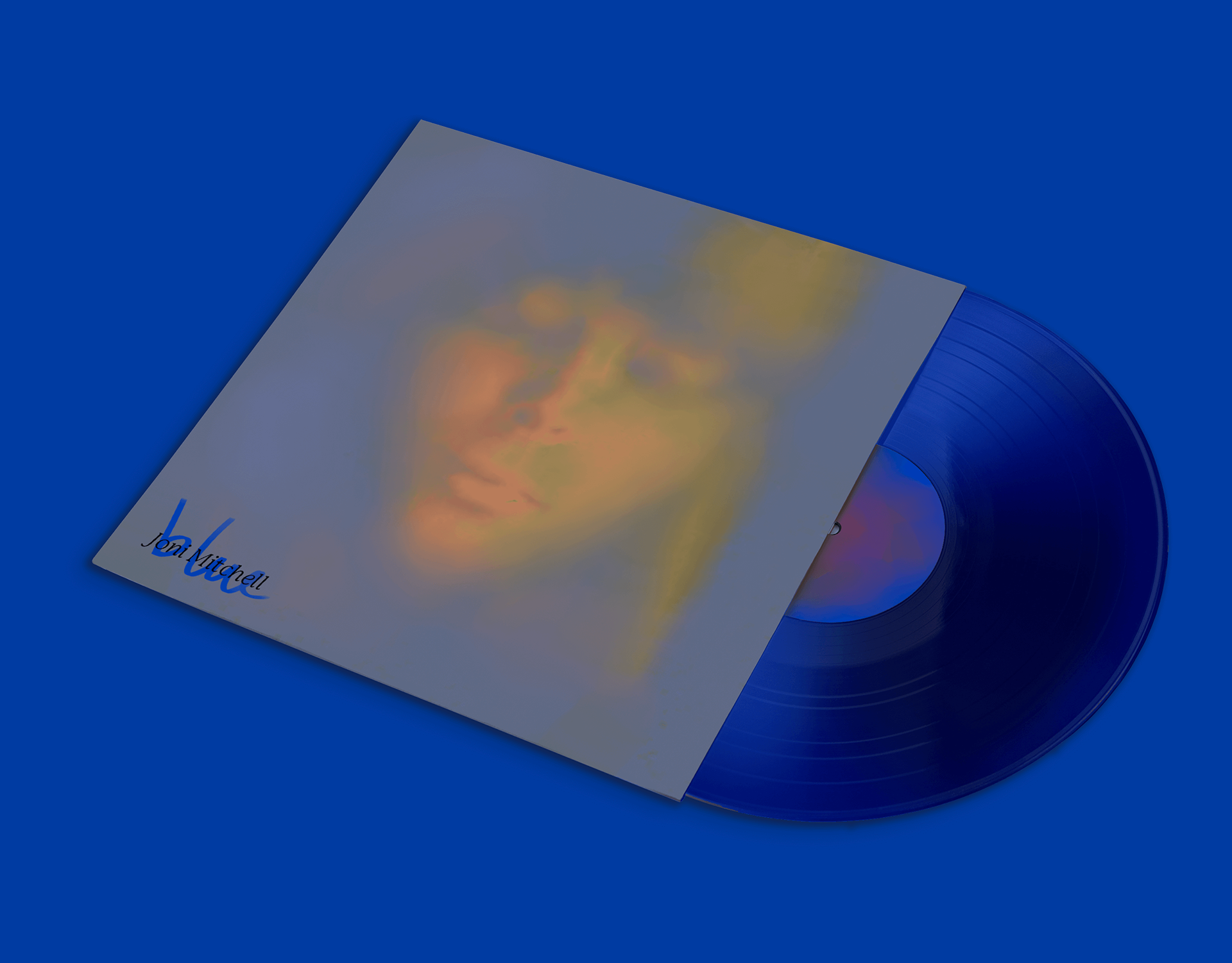
The first feature to draw one’s attention is the exchange of the iconic blue on the cover for its complementary color: yellow. Analyzing the original version, I felt some redundancy between the title and the color pallete, a flaw I saw as an opportunity to exploit the “vulnerability” concept on the use of gradient. Despite being a visible face, the element does not have much chromatic contrast, assuring more proximity between tones and illustrating the complexity of Joni’s emotions, as it reflects the conflict between how the audience saw her and how she saw herself, resulting in undefined matter.
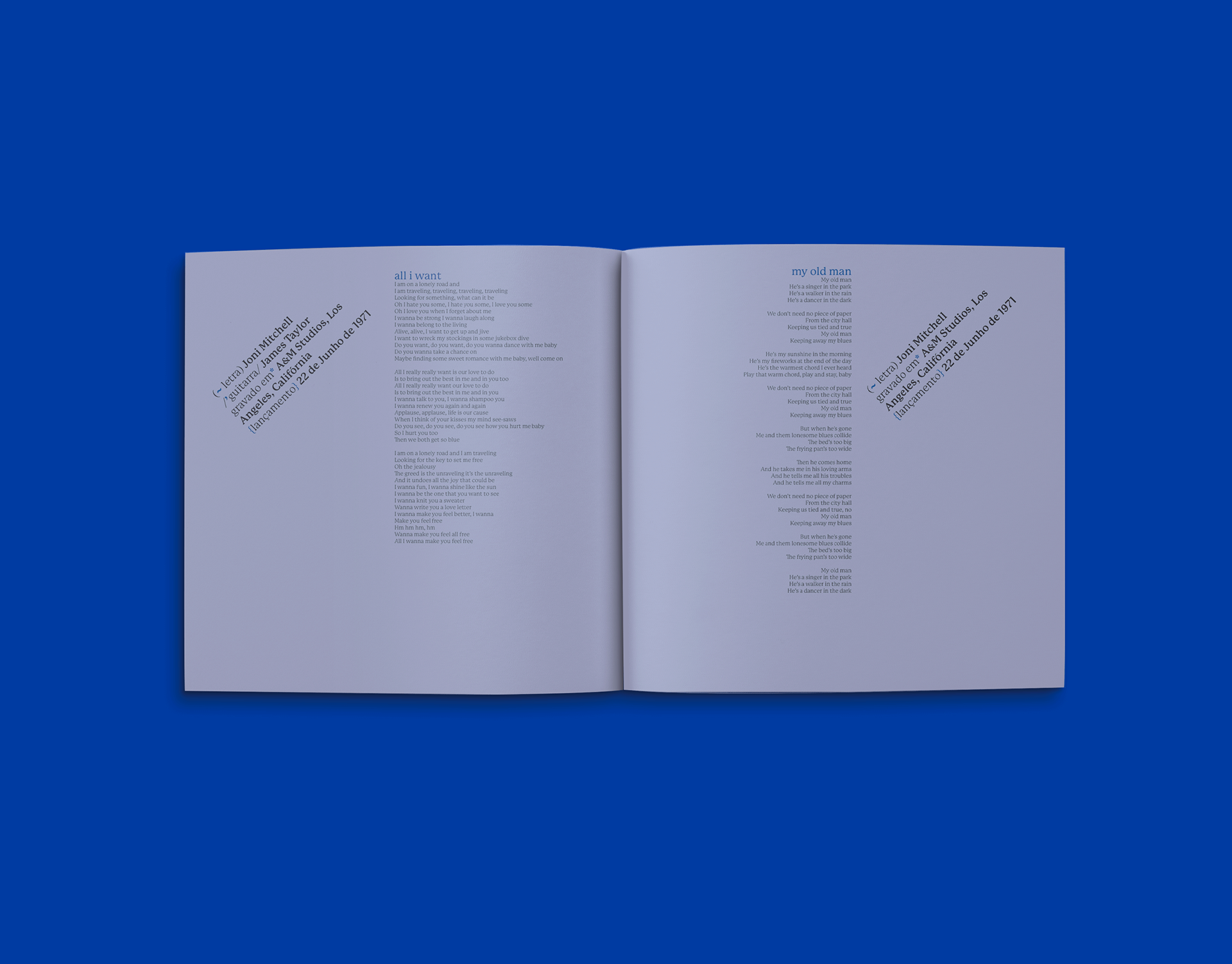
It was my intention to create a dialogue between the exterior and the interior of the album, representing a conflict typically found in depressed individuals: not fully expressing their true feelings.
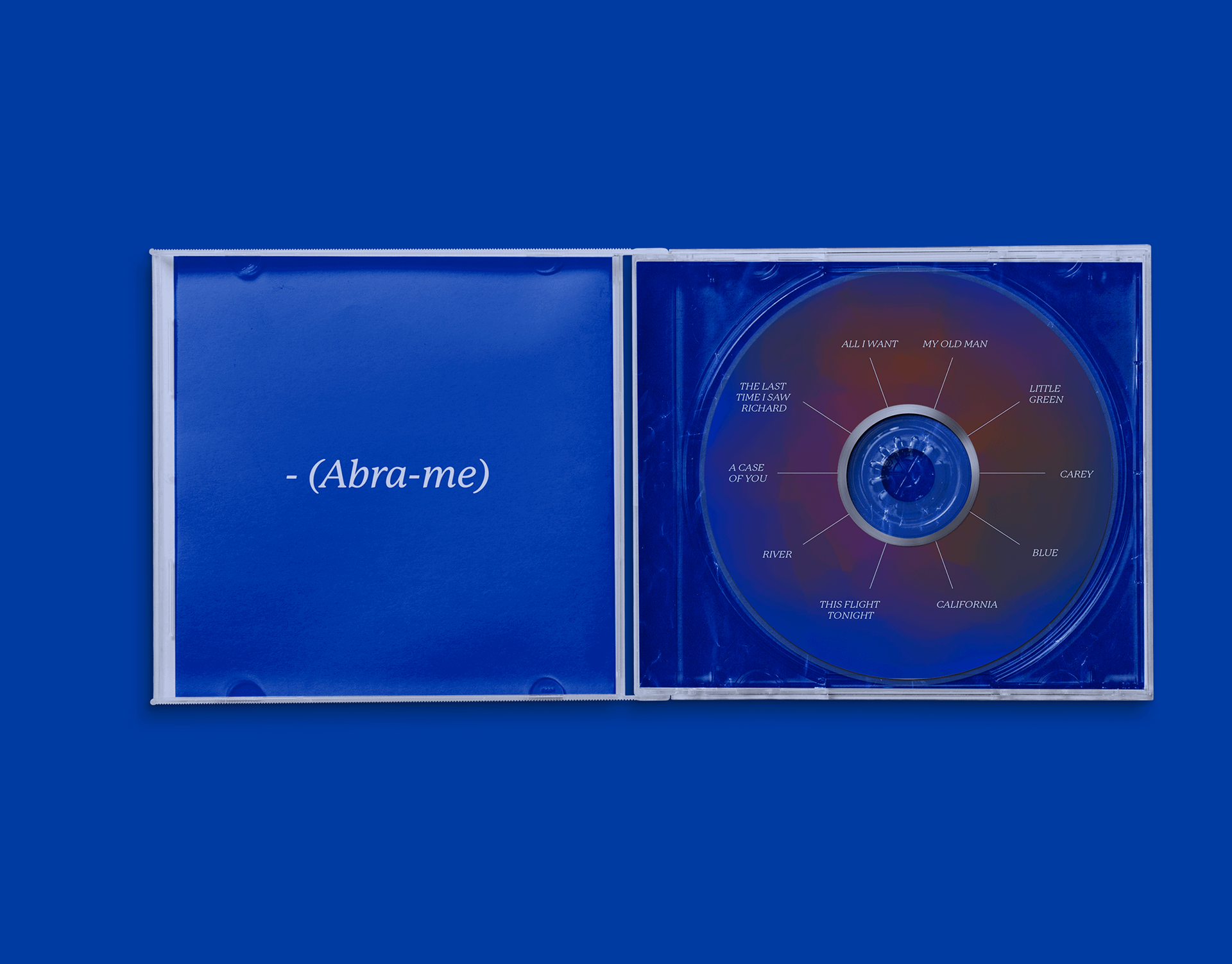
The cover of the booklet was explicitly inspired by the book Alice in Wonderland, by Lewis Carrol. The imperative instructions were borrowed from Alice’s bottles and used here to verbalize Joni’s desire to invite the audience to know her and to “open her up”.
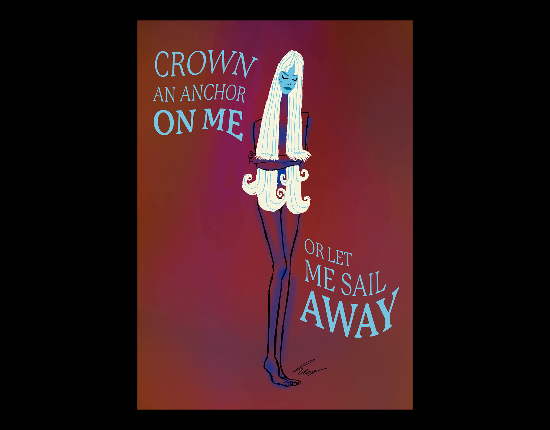
For the Art Direction subject, I was also asked to create a free themed poster, which I linked with the album project, creating a collectible piece that would go along with the album’s version in LP.
An illustration to the title song of the album, the poster represents Joni sadness in her facial expression, but the feeling is even more explicit in her hair, that resembles a waterfall. There is also intention in the representation of her body, the nudity recalls the vulnerability and represents the concept of the shell, which the singer makes use of in the song: a protection of the inside, a barrier from the outside.